vodilna slika

Logo & symbols

Official Symbols

Municipality of Novo mesto acquired its official symbols on July 15, 2004, when the Municipal Council adopted the Ordinance on the Coat of Arms and the flag of Urban Municipality of Novo mesto.


Coat of Arms

Municipality of Novo mesto's Coat of Arms presents its founder, the archduke Rudolf IV., clad in red, Slika 4sitting on the golden throne, holding a blue orb of state in his right hand, and a golden feudal flaglet in his left, the throne stands on a green surface in a silver shield. The coat of arms of the the Urban Municipality of Novo mesto is depicted on an elongated shield in Early-Gothic style.


zastavaFlag

The flag of the Municipality of Novo mesto is yellow, white and red, with the municipal Coat of Arms on the first yellow square of the flag. The fly end of the red field bears a right-ascending diagonal white band, whose width is 1/3 (one third) the height of the flag.

The flag of the Town of Novo mesto is rectangular in shape, the ratio of its height V to its length L being one to two and five tenths or V/L = 1/2.5.

The horizontal version of the flag has the vertical municipal coat of arms on the yellow square of the horizontally laid flag, and an ascending diagonal white band on its red fly end.

The vertical version of the flag has the vertical municipal arms in the yellow square of the vertically-hanging flag. Compared to the horizontal form, the flag is to be rotated by 90 degrees, so that the red fly end hangs vertically down, and the diagonal white band ascends to the left.


Corporate Visual Identity

Corporate visual identity of the municipality of Novo mesto is used in accordance with the instructions, since this is the only way of providing unified recognisability of our visual identity. Individual elements of corporate visual identity are defined below, as follows.
 
A complete logo consists of
the monochromatic version of the coat-of-arms (left) and the Novo mesto emblem (right).

Slika 1


Depending on the purpose, it may be sensible to use independently either the coat-of-arms or the Novo mesto emblem.


Description of Corporate Visual Identity of the Municipality of Novo mesto

The logo of Novo mesto (originally, the logo was prepared by Mr. Gregor Ivanušič and selected on a public call in 2014, for the purpose of celebrating the 650th anniversary of obtaining city rights and the foundation of the city) consists of a monochromatic version of the official coat-of-arms and the name of the town, showing the five elements that most effectively present the features and the soul of our town.
 
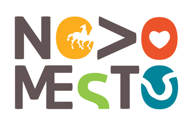
1. Town of history. The element from the Hallstatt period illustrates the rich history of the Novo mesto area, ranging from the Prehistoric period to the Middle Ages and the Modern Period.
2. Town of development. The letter "V" is 90 degrees rotated and, thus, converted into an arrow which illustrates the orientation of the town towards development. Namely, the town is proud of its industrial development, its centre for higher education, nonetheless, the town has a great desire to establish its own university.
3. Town of heartfelt and happy people. A heart is a symbol of love, understanding and hope. Novo mesto is and shall remain a town of happy and cheerful people.
4. Town of nature. Novo mesto coexists with nature and is surrounded by the Krka river, trees, well-tended parks and fields.
5. Town of creativity. A flow of infinity, which illustrates the infinite creativity and the freedom of spirit. Novo mesto is a dynamic town, which is reflected in its artistic participation, social movements, research and ambitious sports achievements.
 
The logo consists of a monochromatic coat-of-arms and the name of the town, together with the five elements that best describe the town’s characteristics. Despite the fact that the logo has a great informative aspect, it meets the eye as a very consistent and simple graphic element. The designed solution of the logo and other elements of corporate visual identity makes it easy to use through its pure, unique and recognizable form.
The logo has all the characteristics of a simple and recognizable symbol, which is the basis for the design of a flexible, simple and recognizable corporate visual identity system. What is more, even the selected colours give meaning to the logo. In combination with the selected colour shades, the elements give a sense of playfulness and attract attention. With the selected colours, the logo raises positive feelings in people.


Logo – Coat-of-arms and Emblem of Novo mesto (also in black and white and negative version)

Slika 1

The logo may be reduced to up to 1.5 cm of the longer side of the logo.

Logo colour.jpg

Logo black and white jpg

Logo negative jpg

Logo colour ai


Independent Use of the Emblem (also in black and white and negative version)
 
 Slika 2


The emblem may be reduced to up to 1.5 cm of the longer side of the emblem.

Emblem colour jpg

Emblem colour pdf

Emblem colour ai

Emblem MONM ai

Emblem blak and white jpg

Emblem black and white pdf

Emblem black and white ai

Emblem negative jpg

Emblem negative pdf

Emblem negative ai


Independent Use of the Coat-of-Arms (mono version or the official version according to the Ordinance)

When using the coat-of-arms independently and for more clerical purposes, also the valid Ordinance on the coat-of-arms and flag of the Municipality of Novo mesto ought to be used in addition to the use of new monochromatic solutions.

Slika 3

Slika 4

Colour coat-of-arms jpg

Black and white coat-of-arms jpg

Coat-of -arms negative jpg

Coat-of-arms ai

 
 The proposed system of corporate visual identity provides two options for using additional graphic elements of the corporate visual identity.


The silhouette in distinctive colours (also in a monochromatic version of one of the defined colours with low saturation to 20%)
 
 Slika 5
 

Silhouette jpg

Silhouette.pdf

Silhouette ai


Distinguishing Pattern Derived from the Emblem (also in black and white and monochromatic version (R 102, G 51, B 51, C 55, M 60, Y 65, K 40; Pantone 410 EC; 20% saturation)
 
 Slika 6

Pattern emblem.pdf

Pattern emblem png

Pattern emblem ai


 Fonts
 
When writing documents, Arial font (black) is to be used and in the preparation of graphic materials Aller, Aller Light or, secondary, Myriad fonts are to be used.
 
Colours
 
Logo
N > M E inT (R 102, G 51, B 51;C 55, M 60, Y 65, K 40; Pantone 410 EC),
O with the element of a situla (R 255, G 153, B 51; C 0, M 48, Y 88, K 0; Pantone 1255 EC)
O with a heart (R 255, G 102, B 51; C 0, M 75, Y 88, K 0; Pantone 173 EC)
S (R 153, G 204, B 51; C 48, M 0, Y 93, K 0; Pantone 375 EC)
O with a curve (R 0. G 154, B 153; C 81, M 20, Y 42, K 1) Pantone 3145 EC)
 
Coat-of-Arms
Monochromatic version in combination with the logo or independently used (R 102, G 51, B 51;C 55, M 60, Y 65, K 40; Pantone 410 EC).
 

For any additional information regarding the use of the logo, its design or the purpose of the use, please contact the Mayor’s Office (kabinet@novomesto.si).